Beauty...

I LOVE using a pop of color to liven things up. It is a great rule of thumb to live by in fashion and design and your dining table is no exception to the rule. Tablescapes are actually the absolutely perfect venue to demonstrate the power of this brightly hued principal!
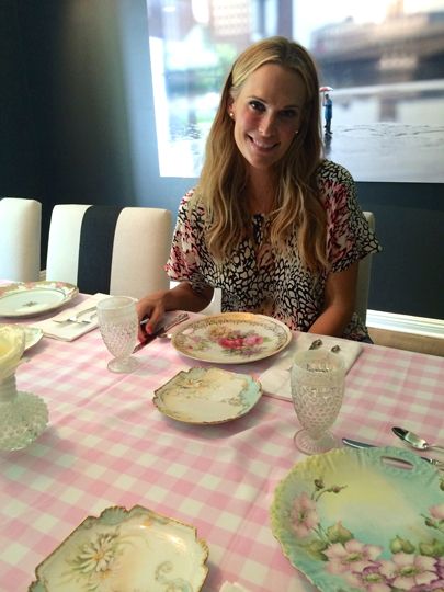
In our first example of chic brightness, I used a pink picnic style gingham to compliment my antique dishes. I think this would be a lovely look for a brunch or baby shower.
You should never be afraid to turn up the volume of your color choices. Bright and bold colors are very en vogue in the land of tablescapes. Look how gorgeous the hot pink looks in the example below. The ethnic batik style print brings texture and beauty to a basic white table.
Our next example is a bit more polished and refined. What I love the most about this look is that although agreeably more upscale, it is not stuffy. I really like the little pop of blue incorporated from the napkin.
Don’t get me wrong, you don’t have to be fussy or overcomplicated to make this look shine. Look how easily the yellow tablecloth dresses up our next example. Gorgeous simple brightness. Easy peasy lemon squeezy!!
I also really love monochrome brightness. Layering your pieces in the same color tone gives depth and style to you tablescape. I’m loving the way yellow is also incorporated into this look. Flowers are always the perfect pop of color!!
Holidays are an excellent opportunity to flex your color popping muscle. Look how lovely the Christmas table is set below. Speaking of holidays, I cannot wait to explore this idea further in Halloween town. Bring on the creepy and spooky.
Everyone needs a little color in his or her life. There are so many routes to take when it comes to tablescapes. Take a chance and add a little vibrancy to your table. I promise you won’t be disappointed. If you are looking for some additional inspiration, we created a Pinterest board to lure you into more color.