Beauty...

By Caitlin Burnett
ICYMI: Molly’s stunning Hampton’s home was featured in Architectural Digest last week, and it’s a moment four years in the making. Fondly described as her happy place, the Hamptons property has been custom designed from the ground up to create Molly’s dream home.
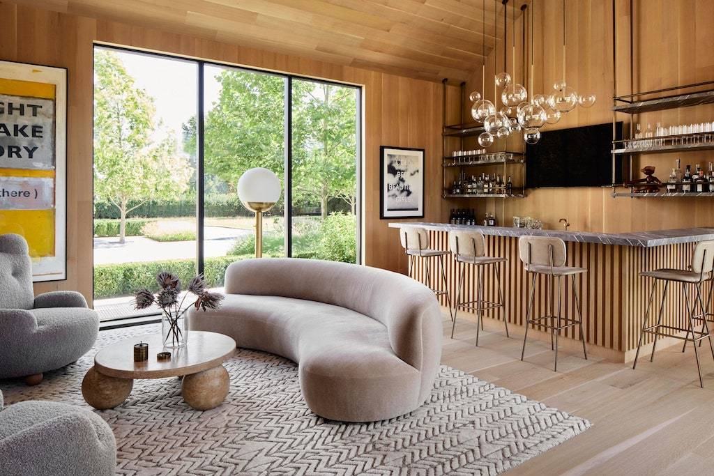
Her talented team of designers, led by Dan Scotti who brought on architect Raymond Renault, worked closely with Molly and Scott to bring their design vision to life—from the indestructible kitchen table to the inviting bar room connecting the guest and leading houses.
Built for entertaining, Dan and the team made sure every detail of the house lent itself to hosting family and friends (as you can see in everything from the large, open kitchen to the outdoor dining terrace that can hold up to 45 guests).
The house is a dream come true for Molly, so hearing it would be featured in Architectural Digest was the icing on the proverbial cake.
To prepare for the AD shoot, Dan and fellow designer Mimi Brown spent days ensuring the house and yard were in pristine condition.
“A house is never really done; there is always some new candle or tray in the even more perfect shade of nude or pink you can add,” says Brown.
“We spent about three days running around to our favorite Hamptons stores grabbing more pillows, blankets, hand towels—just some more finishing touches that make the space Molly’s.” Once the final touches were added, the real fun began.
The team spent an entire day pre-styling the space to ensure the photographers could capture each room’s best angle, lighting, and time of day.
“We always have to adjust furniture for shoots because, as crazy as it sounds, things don’t appear in frames the same way they do in real life,” Brown explains. “I love looking through the lens and realizing the blanket fold isn’t following the same lines as the window pane and needs to shift a quarter inch or that the pillows are reading too far apart— It’s one of my favorite things about a photoshoot, actually!” As you can tell from the photos, the mission accomplished.
While the design team prepped the house, Molly worked with her wardrobe and beauty teams to create looks that would embody the spirit of the home.
She enlisted the help of stylist Sonja Christensen to select pieces that would complement each room. “We chose looks that would play off all the natural tones in her home,” says Christensen.
For the backyard shots, she chose one of Molly’s favorite designers, Ulla Johnson—the color palette and tiered details on the Emi Maxi Dress perfectly juxtaposed the lush backyard. They paired it with classic Jennifer Fisher gold hoops and a clean neckline, allowing the sleeves on the Ulla Johnson dress to shine.
For the second look shot next to the bookshelf, they chose a rich brown hue to draw your eye to the decorative bookshelves and white oak. Accented with Anita Ko and Jenny Bird jewelry, this Thia Thiam dress and Aquazzura heels were pulled from Molly’s closet to add a personal touch.
Once the outfits were selected, the attention turned to beauty.
Molly’s glam team Matthew Monzon and Gianpaolo Ceciliato wanted to complement both the house and the outfits, so they decided on a beautiful look that was both chic and effortless.
Each of the two dresses she had chosen featured beautiful oversize sleeve details, so Matthew pulled her hair into a sleek ponytail to allow the sleeves to have their moment.
“I first prepped the clean, damp hair with the R+Co Bleu Essential Hair Tonic throughout the hair, root to end,” Matthew explained. “I then combed the R+Co Bleu Highest Volumizing Mousse through the hair and blow-dried it with a large, round brush to take full advantage of the volumizing mousse.” 
Once dry, the hair was pulled back into a ponytail where he spot-curled pieces to give it more texture. He finalized the look with R+Co Bleu Lifestyler Volume Texture Spray to lock in that lived-in quality.
For makeup, Gianpaolo used exclusively Pat McGrath products to create Molly’s effortless beauty look. “The inspiration was a simple daytime look, but glamorous—she wanted to glow!” explains Gianpaolo.
He started with Sublime Perfecting Primer to ensure the makeup stayed put during the all-day shoot. For her fresh, dewy base, he turned to Pat McGrath favorites like Skin Fetish: Sublime Perfection Foundation, Concealer, and Setting Powder. To add a soft, daytime glow and natural flush, Gianpaolo used the Divine Blush in LoveStruck on cheeks and Glow Highlighter in Venus Nectar.
Finishing off the look with the lips, he used the MatteTrance Lipstick in shade Christy and Lip Fetish Sheer Color Balm for a timeless pink pout that pulled the whole look together.
The shoot was a true pinch-me moment for the entire team, but like any photoshoot, not everything went exactly according to plan.
The kids’ playroom may look pristine in the final photos but it took multiple resets to get the shot—Each time it was set up just right, Molly would find Brooks, Scarlett, and Grey with their toys sprawled out everywhere.
Kids will be kids, right? Playroom cleanup aside, the team couldn’t be happier with the final images and Molly is still basking in the family’s first official summer spent in their dream home.
For more info on the design process and final images, check out the full story on Architectural Digest.
Design Team Credits: Dan Scotti, Raymond Renault, Mimi Brown, LaGuardia Design Group, & Brigette Romanek.