Beauty...

I love a fresh floral arrangement more than anything. When I’m looking for inspiration, I always look to one person: one of my best friends and Everyday Chic influencer, Mimi Brown. Mimi has her own floral design studio in NYC and has created tablescapes for everyone from Zac Posen to Net-A-Porter and Goop.
Even though Mimi is a professional, she’s taught me that creating a beautiful tablescape is easier than it looks, and, definitely not something to be intimidated by.
Recently, she stopped by my house in Los Angeles to help me switch up the seasons and transition into fall. I was obsessed with her inspiration and I’m looking forward to recreating it for our Thanksgiving meal.
I mean, how beautiful is this?!

I’ll let Mimi take it from here…
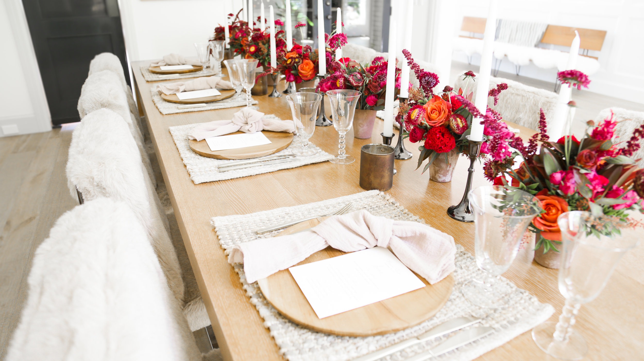
I always start with my inspiration and built it from there. This can come from practically anywhere. For this tablescape, specifically, my inspiration was all about color. The typical fall palette is often a combination of red, orange and yellow. To make it unique, I used monochromatic color for a modern approach.
I love the electric fuchsias combined with the chocolate browns. I found one of my favorites roses “Coffee Break” (how much do we love that name?!) and some bright celosias and coxcombs and boom – color palette born.


This color scheme fits perfectly with the wooden chargers, brass flatware, and straw mats. It’s a great mix of rustic and chic. The vessels are a matte mauve which I thought would be a nice compliment to the electric fuchsias of the coxcomb – again modern take on fall color.


I think it’s important to mix the intensities – bright pink tones vs. matte ones. This always adds depth so keep that in mind – bright orange vs. muted terracottas – whatever your color palette is try combining different intensities of one color range – you’ll be pleased.
And also – BRIDGE COLORS (which give you an ombre effect) are super important. For instance, here there are multiple shades of chocolates to magentas to fuchsias that really tie the colors in nicely together and create a flow to the arrangement.

If you are using pink and orange, don’t just buy pink and orange flowers – buy a variety of pinky orange toned flowers to bridge the straight up pink flowers to the straight up orange flowers.
Florals: Since these are seasonal, your best bet will be your local flower market. Most cities, big or small, have some sort of flower market or farmers market. That’s where you’ll find the freshest and most unique. The LA Flower Market is AHHHMAZING. Full of fresh local product and the best selection besides the actual flower market in Amsterdam there is. I was ecstatic to find the chocolate spray roses and also the pieris – one of my favorite ingredients.
Table Decor It’s all in the details.
Lighting: I used black nickel candlesticks, white taper candles, and copper toned votives to complete the look and add a soft glow. It also paired nicely with Molly’s front door and the steel glass French doors that lead from the living room to the dining room. For candlesticks, always make sure to order the long-burning, dripless candles that burn 8-10 hours.
Flatware: I am a SUCKER for brass flatware. Seriously, can’t get enough of it. Go luxe or find a great knockoff at places like West Elm, Crate & Barrel, or even Target.
Linens: Grey linen napkins from Silk and Willow –the MOST fabulous supplier of linens and ribbons and all lots more.
Menus: I am also a SUCKER for letterpress menus with names done by hand in calligraphy. Nothing better! Tiny Pine Press is a great option or do it yourself on Paperless Post.
For more inspiration from Mimi, check out her website here and follow her on Instagram at @mimibrownstudio. She’ll be sharing her inspiration for the winter holiday in the next few months…so stay tuned!
You can also find her in my new book, Everyday Chic as one of my experts. Order your copy here.